

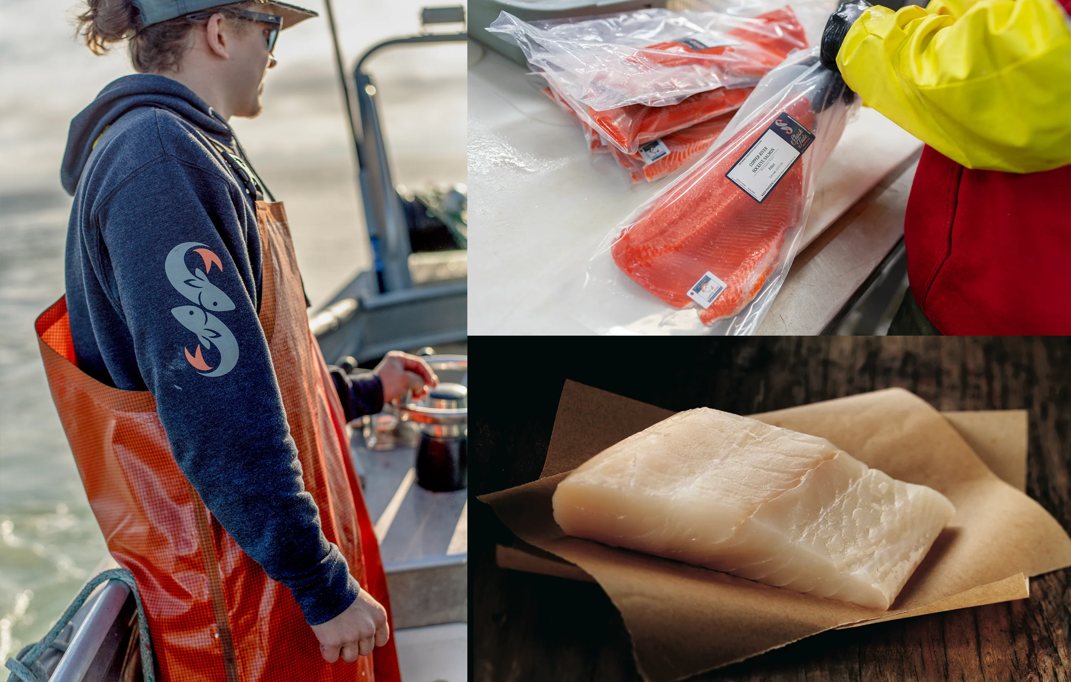
SLACK TIDE SEAFOOD
With the goal of rebranding an outdated and stale logo for a Chepo’s Mexican restaurant, We set out to create a sleek and simplified representation of the establishment's identity. Recognizing the importance of modernization and a more sophisticated visual appeal, we removed excessive colors and bold details, opting for a minimalist approach. By focusing on clean lines, refined typography, and a limited color palette inspired by Mexican culture, we successfully crafted an elegant and sophisticated logo. The new design not only captured the essence of the restaurant's offerings but also attracted a wider audience, inviting them to experience the refined flavors and ambiance of the Mexican dining experience in a contemporary setting.